close-sidepanel close-sidepanel
Fontfabric™ Logo
Fontfabric™ -

Fontfabric
Bestseller Fonts

Some typefaces write their own history.

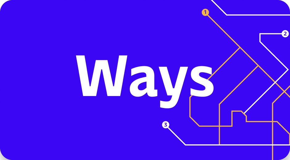
Ways typeface name in white on electric blue, with a numbered metro-map line graphic
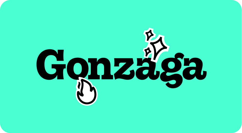
Gonzaga typeface name in bold black serif on mint green, with sparkle and flame stickers
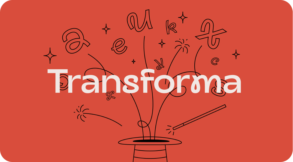
Transforma typeface name on red, with letters flying out of a magician's top hat
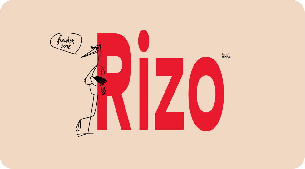
Rizo typeface name in bold red on beige, with a sketched stork saying "freakin cool"
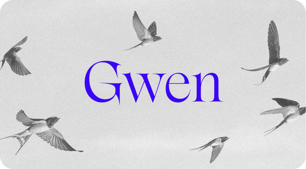
Gwen typeface name in blue serif on a grey sky with flying swallows
Fontfabric Bestseller Fonts

Some typefaces write their own history.

Since their launch, these fonts have become a go-to choice for creatives. Designers all around the world keep coming back to them for branding & advertising projects, editorial work, web and app interfaces. The variety of forms and styles allows you to go bold on titles and literally turn heads, write long body copy and never worry about readability, and create visuals that speak for themselves. Sharp display cuts, dependable text families, versatile sans and expressive serifs all prove that great type is a tool that keeps delivering.

These are the fonts our community reaches for first, the ones that show up in portfolios, packaging, posters, magazines, and product screens. Whatever your next project is, start here. Every bestseller is a proven pick. Want to see for yourself?

Tags
How to Use them

The Right Type for Every Type of Project

In a world full of great type, the paradox of choice is a real thing. We may fall in love with a serif when the project actually calls for the clean lines of a sans.
Our advice? Match the font to the job: display cuts for bold titles, text families for long reading, and versatile sans for interfaces. Pair one expressive voice with a calmer one, build hierarchy with weights and sizes instead of adding more fonts, and always test on real content and real screens. Explore OpenType features to get even more out of every font and don’t forget the importance of choosing the right license.

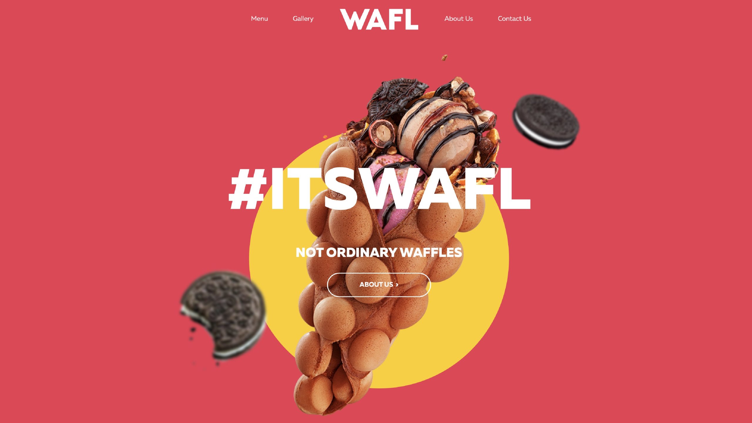
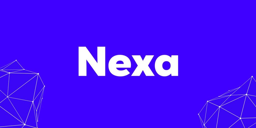
Nexa

Clean geometry gives Nexa its structure. A friendly character makes it easy to live with. Use this versatile sans serif to connect the pieces of a visual identity, from a confident headline to the supporting copy. It’s a natural starting point for branding, editorial layouts and websites that need a clear, consistent voice.

Good for: Brand identities, Editorial, Websites
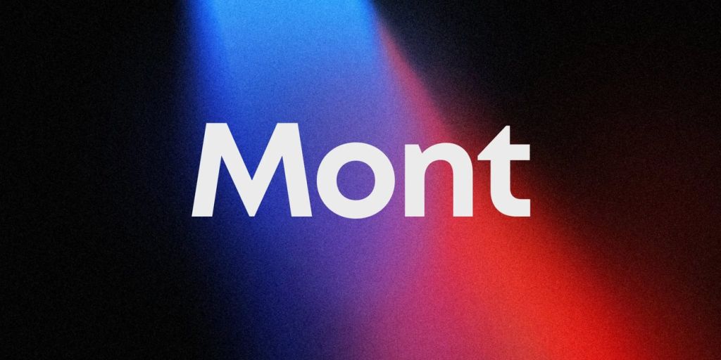
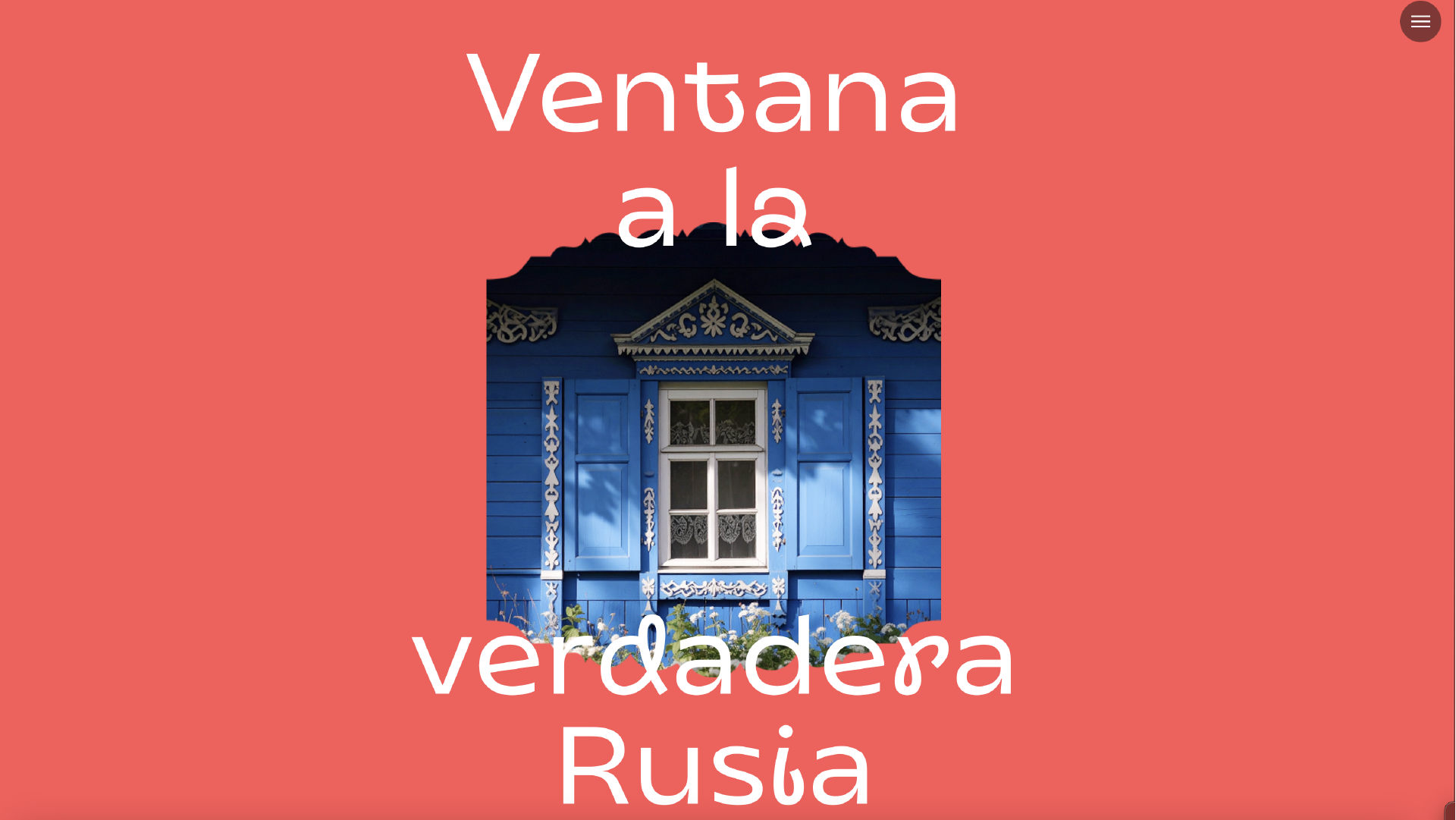
Mont

Mont combines circular forms with sharp details that give familiar geometry a distinctive edge. Put it to work in a brand system, a digital product or an editorial layout. Let the heavier weights lead the conversation, then use the lighter styles to create contrast and give the composition room to breathe.

Good for: Brand systems, Digital products, Editorial

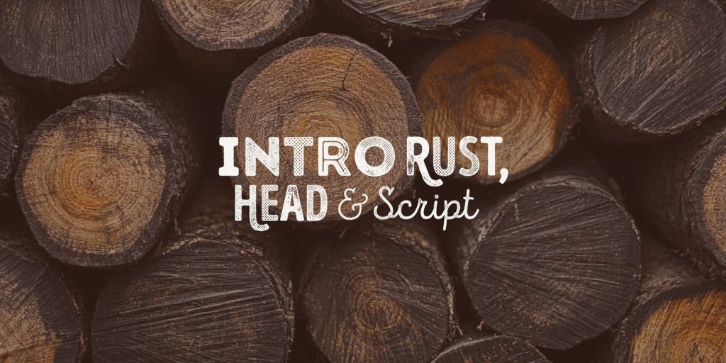
Intro Rust

Intro Rust turns words into a visual statement. Its mix of textured display styles and script elements gives you room to build expressive combinations within one collection. Try it on posters, album artwork or packaging, where type can take centre stage. Keep supporting text simple and let the headline do the talking.

Good for: Posters, Album artwork, Packaging

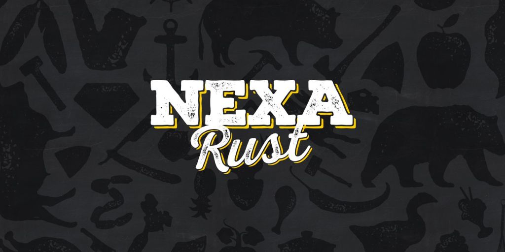
Nexa Rust

Nexa Rust brings a handmade spirit to the Nexa family. Sans, slab, script and decorative elements give you plenty to mix, with texture adding warmth to the composition. Use it for food and drink packaging, menus or bold brand graphics. Start with a strong headline, then add a contrasting script or a decorative detail.

Good for: Packaging, Menus, Brand graphics

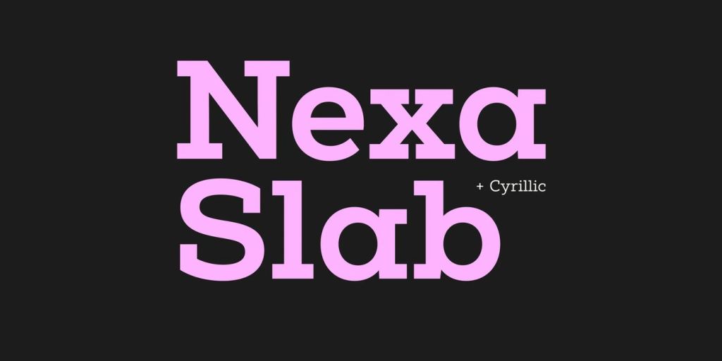
Nexa Slab

Nexa Slab gives geometric typography a solid footing. Its sturdy serifs and rounded inner shapes balance confidence with warmth. Try it on packaging, editorial titles or a brand identity that needs a more substantial voice. Pair it with Nexa when you want contrast between sans and slab while keeping a clear family resemblance.

Good for: Packaging, Editorial titles, Logos

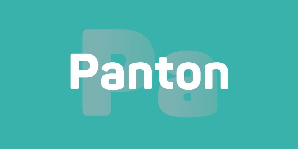
Panton

Panton softens geometric forms into a welcoming, contemporary sans serif. It’s a useful choice when a brand needs to feel approachable while keeping its communication clear. Explore it across packaging, campaigns and websites, using weight to move from an easygoing introduction to a headline with more presence.

Good for: Packaging, Campaigns, Websites

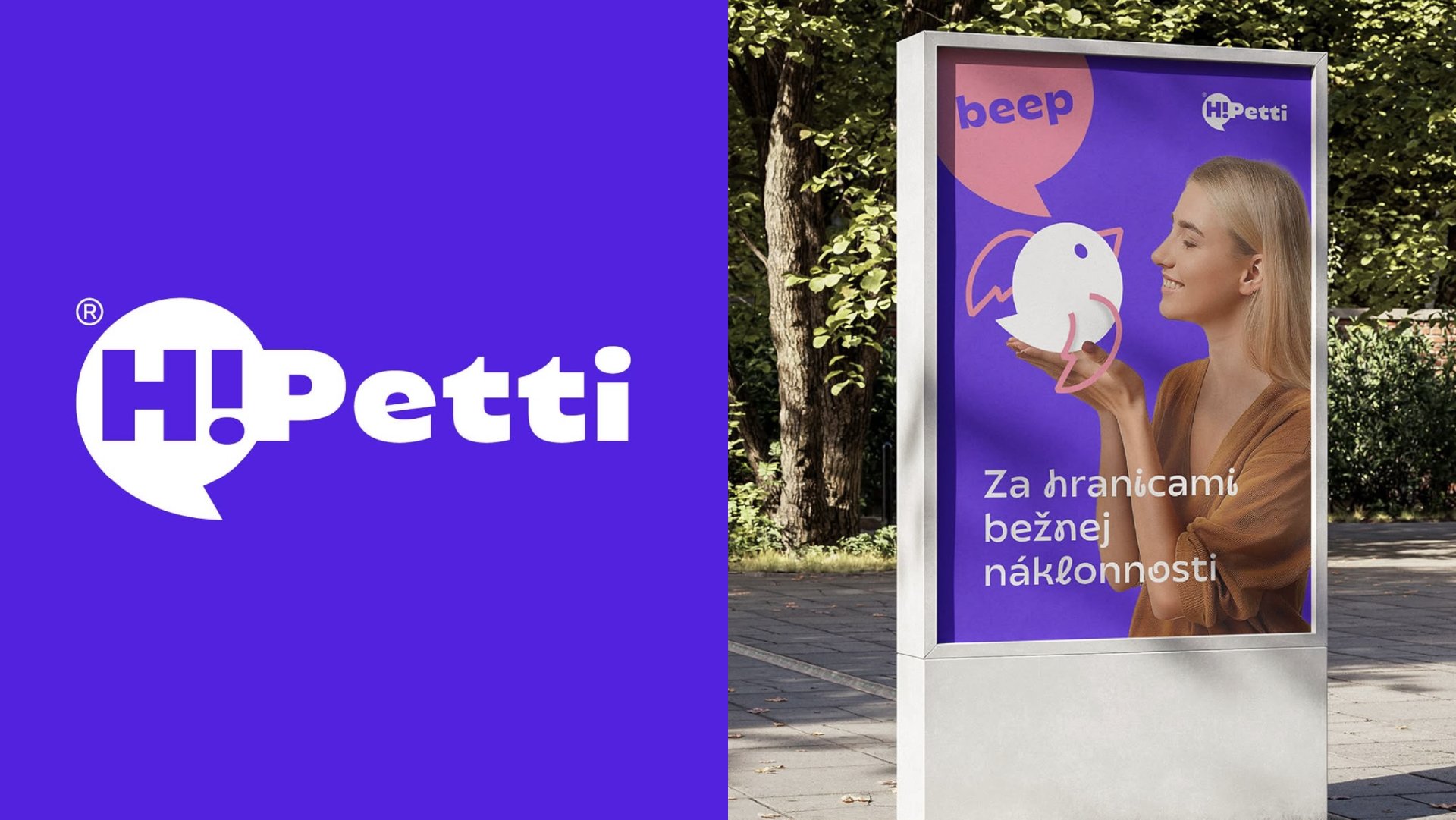
Uni Neue

Uni Neue brings a geometric backbone and subtly rounded corners to a clean, contemporary sans serif. That balance gives it a professional yet approachable character. Use it to carry a visual identity across websites, presentations and printed material, especially when the typography needs to support strong imagery and keep the message easy to follow.

Good for: Visual identities, Websites, Presentations

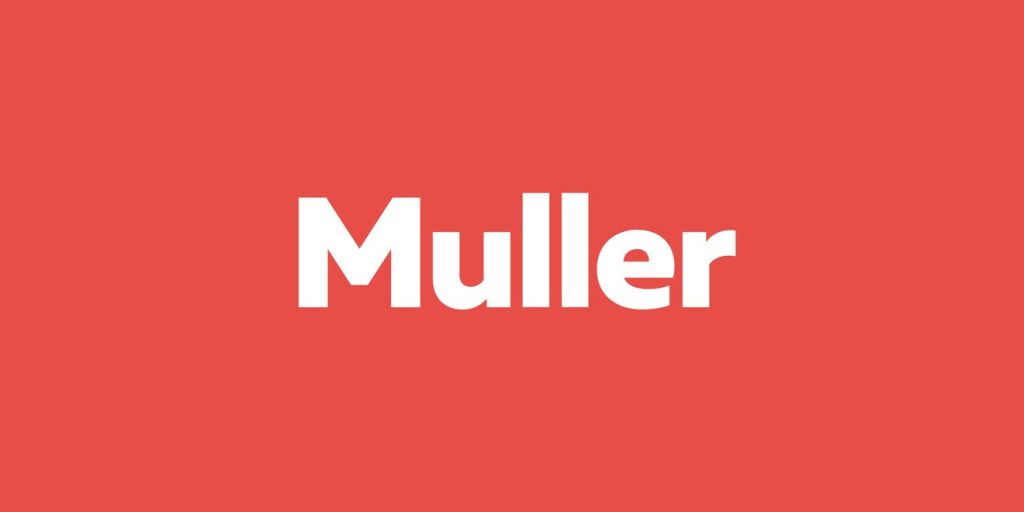
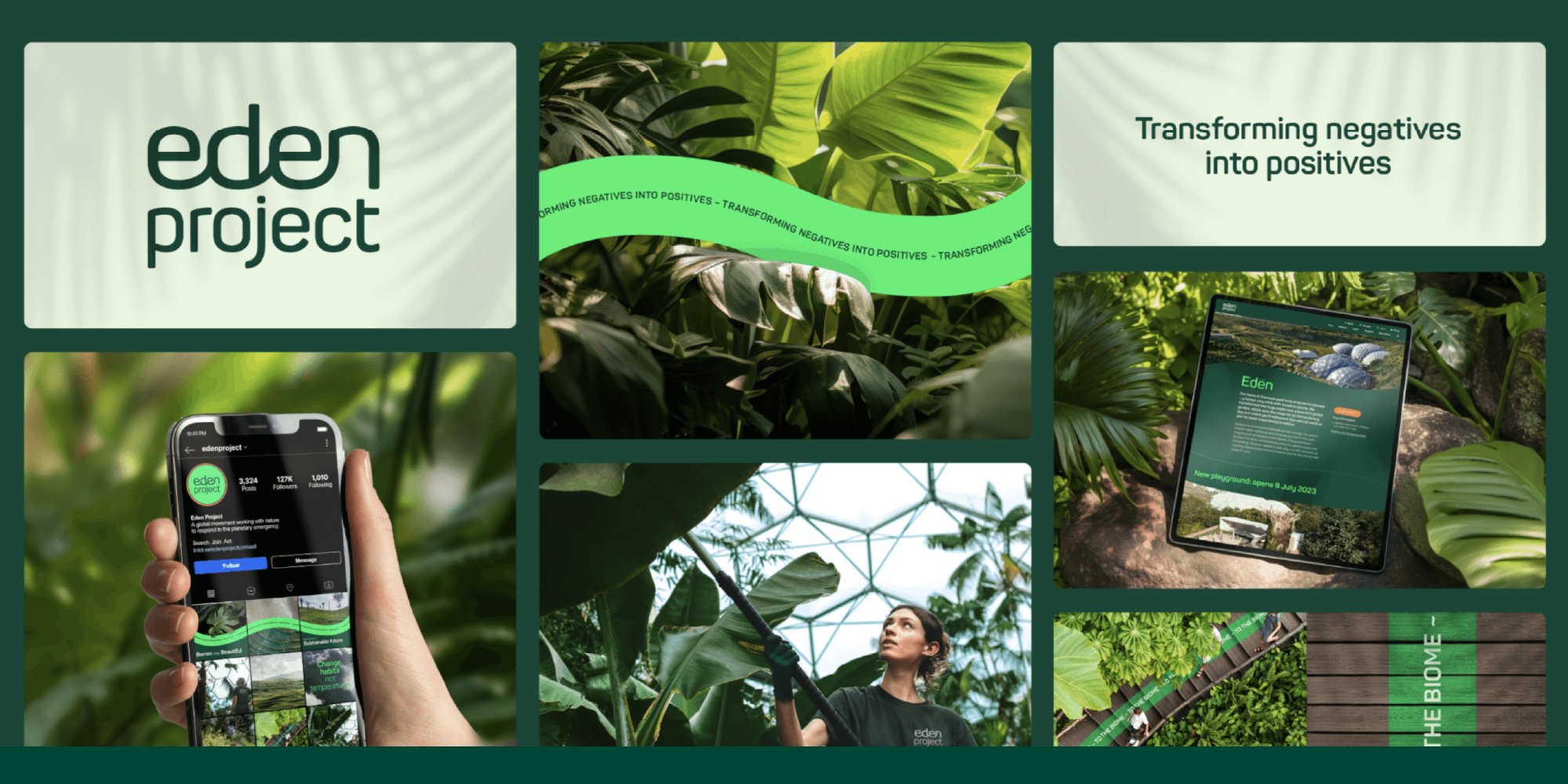
Muller

Muller is built to move between the big statement and the small detail. Its balanced proportions make it a versatile starting point for editorial layouts, brand communication and digital interfaces. Use contrasting weights to establish a clear hierarchy, then test it with your real content, from the shortest label to the longest paragraph.

Good for: Editorial, Branding, Digital interfaces

Type in Context

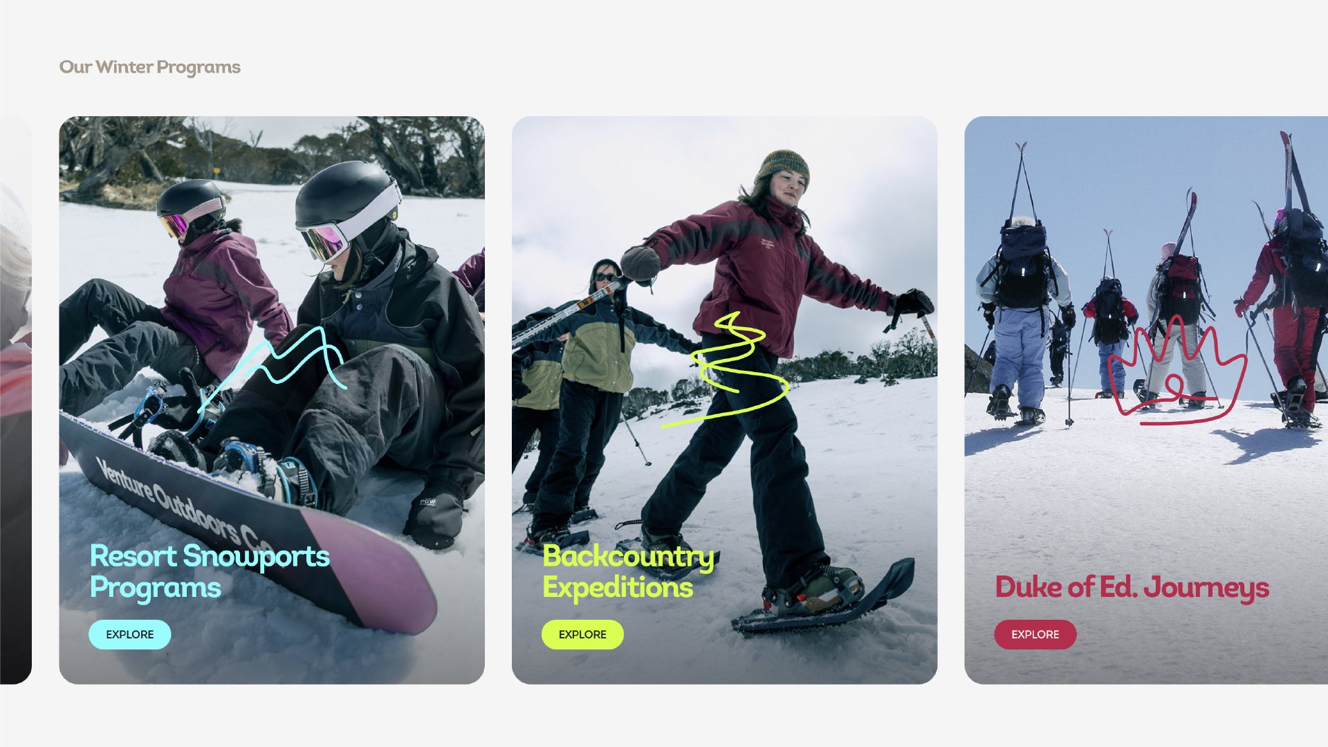
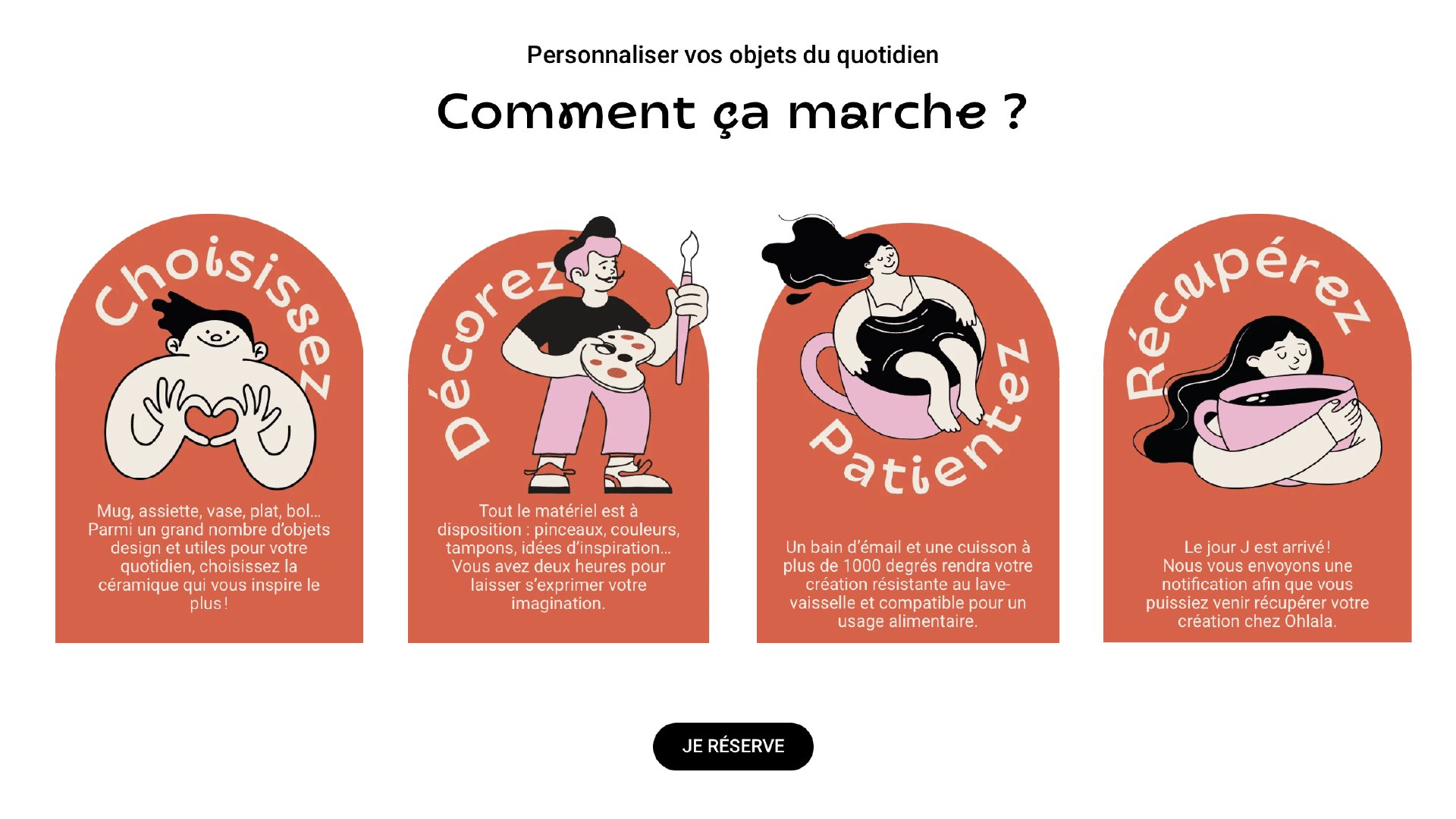
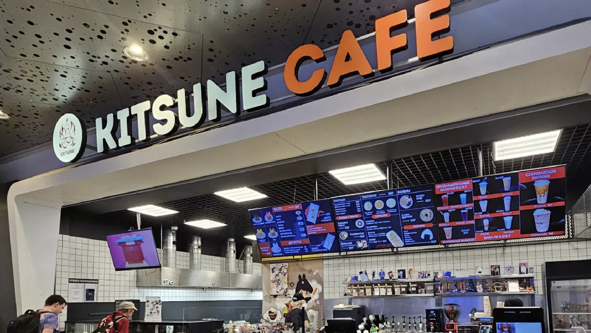
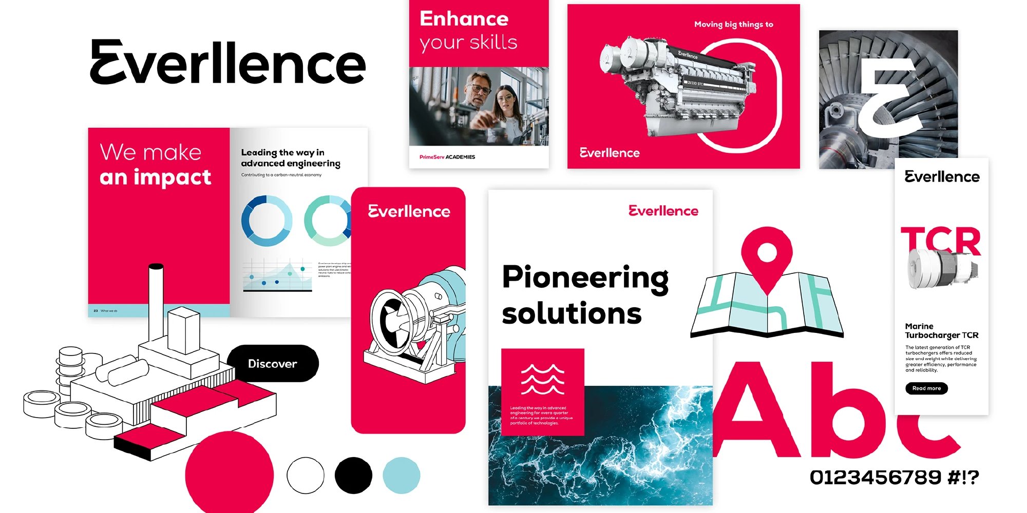
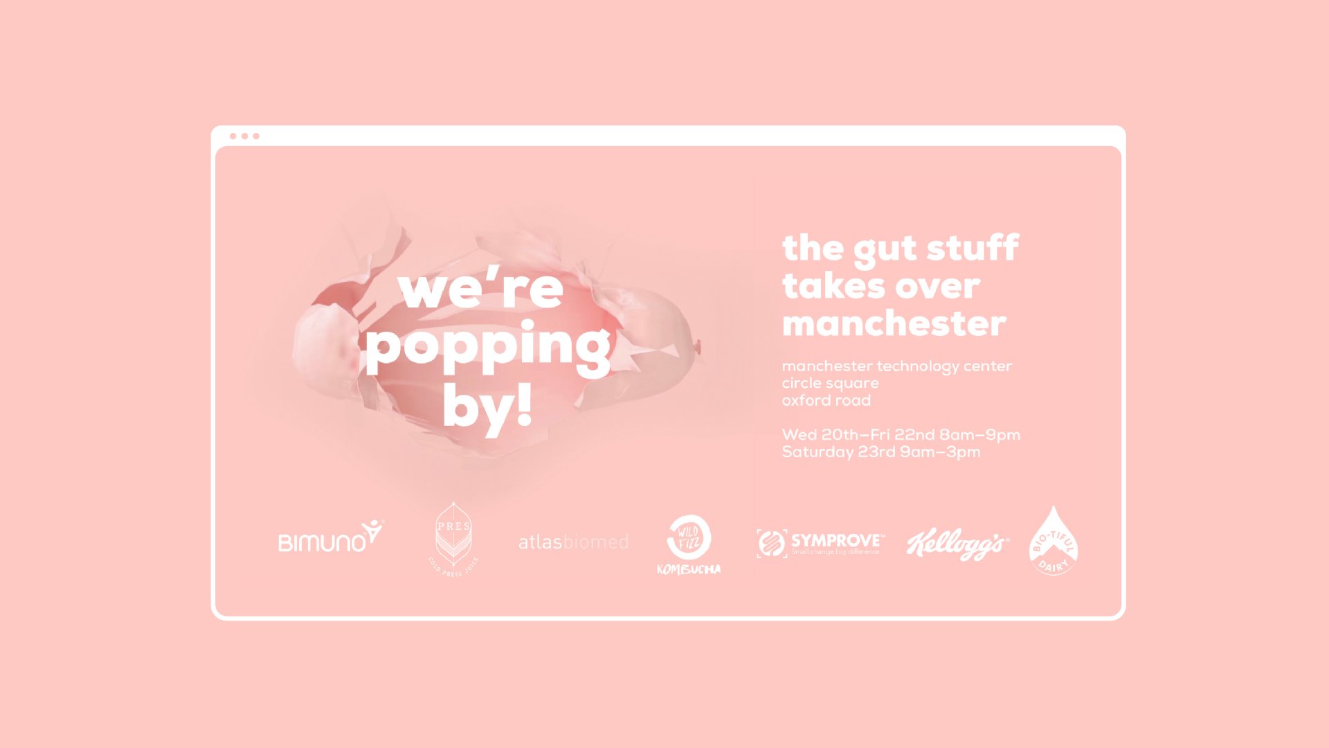
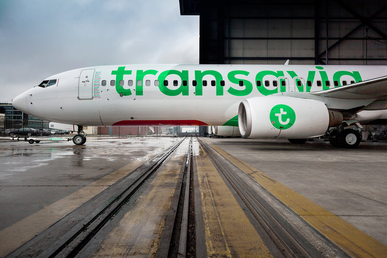
Our fonts have long ago taken lives of their own. Browse through the gallery below to see how designers and brands from all over the world are using our fonts for brand identities, packaging, products, campaigns, and spaces.

Try Before You Buy

Need more time to test our fonts in your own words? Download our trial fonts and experiment with type – no commitment, no time frame to decide.

We’ll send you a zipped file with all trial fonts, license agreement, and installation instructions.

Please note that trial fonts are for non-commercial use only.

FAQs

What makes a font a bestseller?

These are the typefaces our community picks again and again. They’re ranked by real purchases, so they’ve proven themselves in real projects.

Can I pair two bestsellers together?

Absolutely. Pair one expressive font with one calm workhorse, and build hierarchy with weights and sizes instead of adding more fonts.

Can I use these fonts for commercial projects?

Yes, with the right license. Branding, advertising, packaging, editorial, and digital products are all covered by our commercial licenses. Check the license details on each font’s page for exact terms or reach out to us at contact@fontfabric.com if you have any questions.

Can I test a font before buying?

Try it first with our free trial fonts, or type your own text in the tester on each font’s page. Test with real content before you commit.

Found your type?

Get it, test it, see what happens.

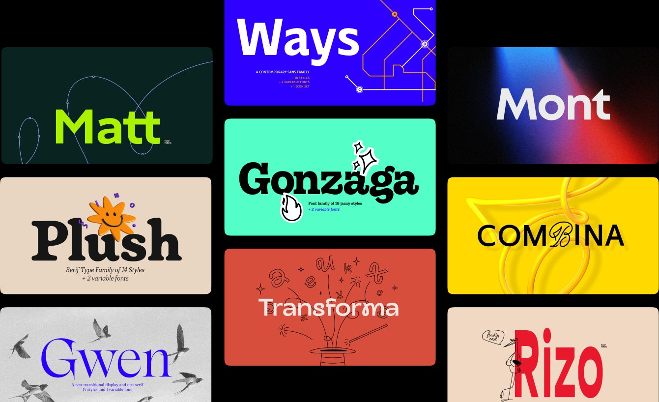
Mosaic of Fontfabric bestseller font cards: Matt, Ways, Mont, Plush, Gonzaga, Combina, Gwen, Transforma and Rizo